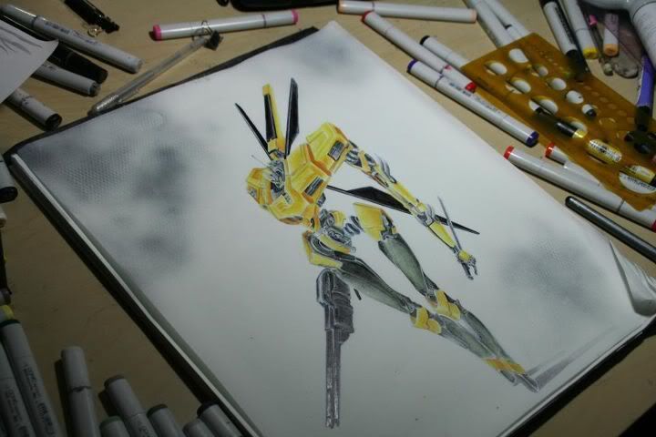
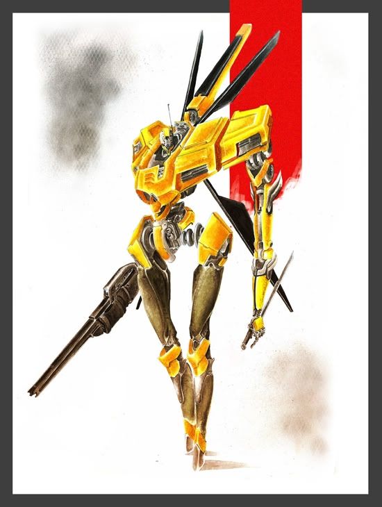
I published this over 2 years ago on my old blog (so old I forgot I had it, so old I forgot I bought a domain for it. Fail.) and finished drawing my marker illustration of the year, which had one of my friends asking me about the
Copic Markers. I also had a friend ask me what markers I would recommend for starting out in marker illustration. I'm no pro, but I have been using these markers for over 6 years or so, and I would say that you should definitely not start with these markers. The alcohol content is very high in these markers which leads to a lot of color bleeding. Like other materials, you'll experience much trial-and-error when using the Copic Markers. Or you can read my tutorial from below and minimize the hair-pulling when you're trying to render leather or velvet. There's no correct way to color; the below is just the way I found easiest for myself.
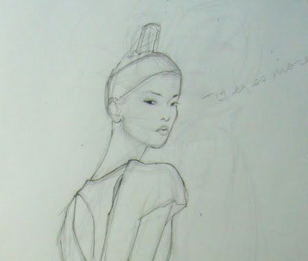
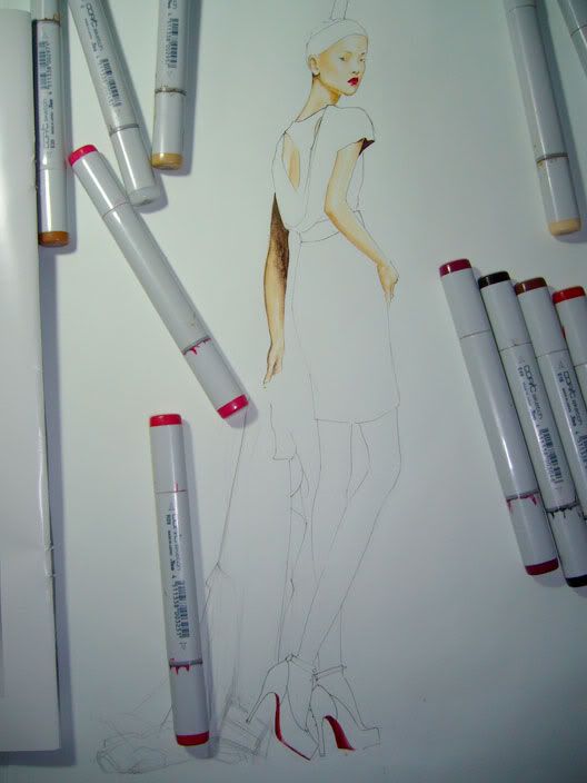
I typically start with a pencil sketch. I use a 0.05 mechanical pencil to keep all the lines fine and minimize the amount of lines I have.
I outline with a
Copic Multi-liner pen after my pencil sketch is finalized. I like using the Copic multi-liner pen because if I accidentally run the marker over the ink lines, nothing bleeds. I use 0.03 Copic Multi-liner pen.
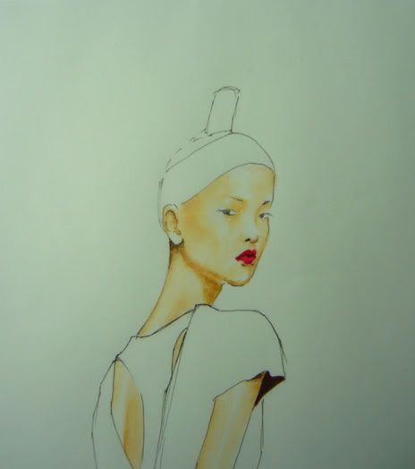
I was always trained to color with the lightest shades first (oil painting, watercolor, pastel...)
For the skin, I used:
E00 Skin White, E11 Bareley Beige, E34 Orientale; the dark brown is
E49 Dark Bark.
For the lips/shoes, I used:
R05 Salmon Red, RV29 Crimson Red, R29 Lipstick Red
Notice I did not add the hair or eyebrows yet.
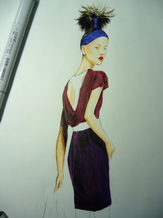
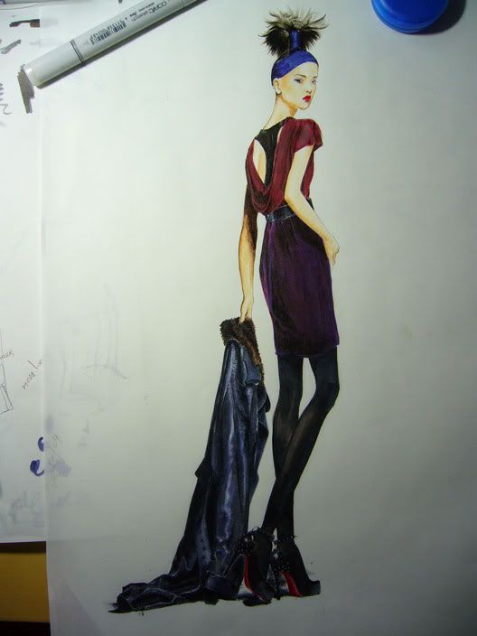
I went ahead the colored in the darker shades (still no hair yet)--the top, skirt and headband. For her top, I mixed 2 colors because I did not have that exact shade. This is the beauty of these markers--you can blend and combine colors to make a color you need but either cannot (1) find, or (2) run to the art store at 12am to buy [which is usually my case =_=] To color the top, I used
PRISMACOLOR Tuscan Red as the base, and then used
E79 Cashew over it. I used
E49 Dark Bark for the shadows again.
The skirt drove me a little crazy--it's a velvet fabric, and I have never rendered velvet before. On top of that, there were 3 visible tones: deep red, red-violet and a light crimson red. No marker exists like that. I ended up using
B79 Iris as the base, running
PRISMACOLOR Tuscan Red and
R39 Garnet over the purple, then using
E49 Dark Bark AGAIN in the dark areas. I alternated which color I layered, in order to enhance the velvet "effect". Obviously leave areas uncolored for the lighter areas. I used
C8 Cool Gray No. 8 at the hem to blend
For the hair, I used (in this order--layer upon layer):
W3 Warm Grey No. 3, W8 Warm Grey No. 8, E49 Dark Bark, and then a little bit of
N6 Neutral Grey No. 6 to blend the colors. I used
C8 Cool Grey No. 8 for darker accents in the hair. For the headband I used
B79 Iris for the base color and
N3 Neutral Grey No. 3 to blend.
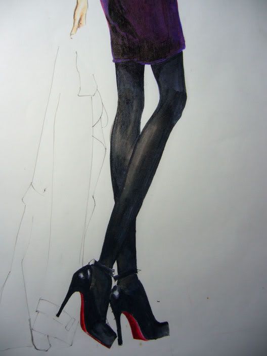
For the nylons, you can see that they are not entirely sheer, so not much of the actual skin tone is peeking through. This became very tricky as the two shades I needed to use for this "look" could result in muddy colors=black and peach. After some tests on my scratch paper, I started with the medium shade of grey, which in my case was
N6 Neutral Grey No.6. I stayed with warm hues since your skin tone is... mostly comprised of warm tones. I used
W8 Warm Grey No. 8 and
C8 Cool Grey No. 8 to blend. For the skin I used
E11 Bareley Beige--First, I used
N6 all over, leaving the skin area white, then used
T6 Toner Grey No. 6 to blend from the
N6, filling the white space. The
E11 will pick up some
N6, but not turn out to be muddy. Then you can go ahead and fill in the darker greys.
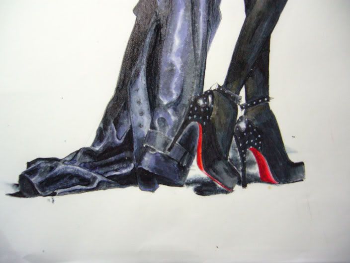
For the shoes, I used
C9 Cool Grey No. 9 first, leaving white areas for the shine of the patent leather, immediately blending with
N6 while the
C9 was wet. I actually used
N2 Neutral Grey No. 2 for the "brightest" part of the shoe, so it's not actually white (too much contrast). I used 100 Black for the darkest parts of the shoe. I would have used
110 Special Black but... all 3 of Special Blacks ran out of ink =_=
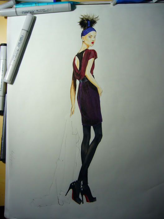
Next, you can see that I am almost finished with the girl except for her leather jacket. I barely even outlined any of the details on the jacket. I didn't even know where to begin with this jacket. It took a good hour to complete, and did not outline the entire jacket in order to keep the soft look of the lambskin leather. I did not outline the fur collar either, simply using shades of grey and brown (starting with the lightest grey) to mark the fur area. The lightest shade I used was
E41 Pearl White, then
E35 Chamois,
E31 Brick Beige, and
E79 Cashew (not as dark as it appears), then adding some details with
E29 Burnt Umber. Finally, I used
E49 Dark Bark again to add details. I also used a bit of
C8 Cool Grey No. 8 to give a little bit of dimension. All those markers just for a tiny fur collar T__T.
I didn't actually use too many colors for the leather jacket. But I had to eye, approximately, where the highlights were, where they stopped and how vibrant they were. I started with my medium dark tone,
C8 Cool Grey No. 8 to fill in the smaller enclosed areas (so I could better control my shading), quickly blending with
B37 Antwerp Blue, also washing OVER the
C8 with this blue. That way you have a hint of the blue and it does not appear as the dominate color. My lightest color was
N3 Neutral Grey No. 3, which was used to blend the lightest areas into the darkest areas. You can use
N6 as well if the colors don't blend smoothly. I used
C9 for the darkest areas of the jacket, applying this color last. The shadow is made with
C9 and
0 Colorless Blender.
You can also see that I finally added the studs to the shoes, using any regular white
Gel-pen. Mine is ridiculously old, but you don't always need expensive, overly fancy tools to get the job done. I added details on the jacket using the
0.03 Multi-liner in Black.
I then added her eyebrows using
PRISMACOLOR Verithins in Dark Brown. I added a light line underneath her eyes using the same brown color; for her lids I used indigo blue and violet--more violet than blue.
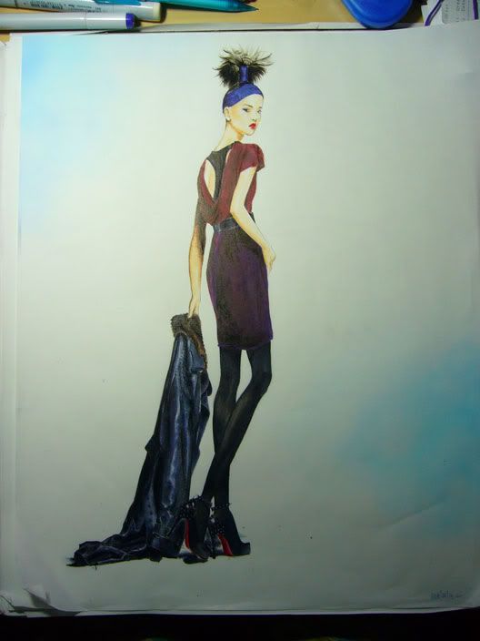
The last and most important thing is the background. I have the COPIC airbrush system so I decided to create a light atmosphere. I first used
B00 Frost Blue, then
B02 Robin's Egg Blue for the darker color. It actually appears darker than it seems.
7 hours later...
I realized I didn't explain the belt or racerback tank. Both are simplified versions (2 colors of markers only) of the leather jacket explanation.
I can't believe I drew this 2 years ago. Gawd I'm old.
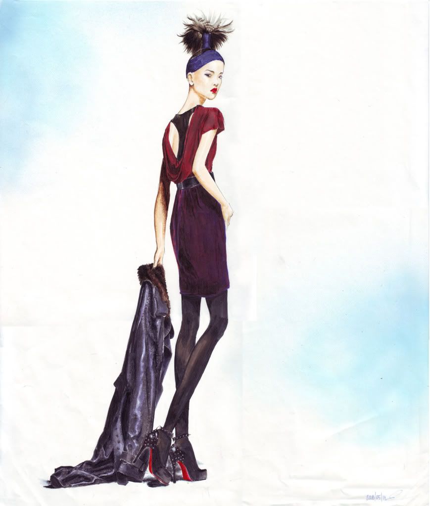
Below is the picture I finished last week, in case you were wondering. You can view a larger, higher-quality version of both images on my
deviantArt page.
(From
Barneys' Fall 2009 catalog. Outfit by
Marni)
*I used a pretty generic brand of 14x17 marker paper for both these drawings.